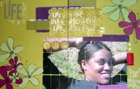
The absolute weakest link to my entry. See...what had happened was when I photo'd the original one pager, it came off very flat. You couldn't tell the patterned paper variations, couldn't see any of the dimension. So I started futzing with the scan in Micro Photo whatever and did a lot of the damage. Started just adding lines to the fabric letters so they would stand out and you could read that it said patch. Then started added digital brads and the journaling and the wreck just could not be turned away from. Alas. Bad thing is it is in my entry packet. Good thing is that most of the horrendousness of this layout is the digital altering sooo...I still have a really great layout I love in person that I can add the digital {s}crap to or I can love it as is. Yeah.


My two pager. I actually like this better in person (of course). But I printed the photo on a sheet of labels and then pieced it all back together. Lots of rubons (of course--my fave), a tailored tab, my second fave product the Scrapworks Hugs...Just like the overall feel of this one. All about life happening and just laughing and smiling and taking it all in stride.
Now, believe it or not. I hatED this when I first created it. Just figured the colors were off and there was something missing. Finally, I added the penned in lines right above the orange cardstock and it seemed to finally have a finished look. Then I sanded the edges and it really finally looked doable. Love how the hugz and patterened paper **used scrapworks with another MF...showed the versatility of their product with others cause really...who only buys from one manufacturer nowadays** worked on this one.
Took the time to pay attention to presentation on this one too. Instead of just going down the list of DT questions, I actually did a really cute word generated layout type deal. Let them know how friggin' out there I am. If only I could figure out how to turn a word file into a jpeg without scanning it, I could post it here or on twop's. Alas. I don't think I can figure it out and it is too date for me to give much of a damn anymore. I'm too frustrated with it.
Did a different take on the 200 words about ourself/stuff we wanted them to know about us. I'll just retype that here. Maybe tomorrow I'll figure out the actual questionnaire stuff.
200 words (or so...)
Are you serious? 200 words? So you really don’t want any scrappers on this team eh? Okay. 200:
B - bold, beautiful, brainy. Check out the blog @ b3designs.blogspot.com
E - ecstatic over my Best of Show win at CK WA
R - Reaaaaallllly fun[ny] all around gal w/the “Best All Around Senior” award
to prove it.
N - Non-traditional. I don’t live in Utah. I’m not married. I have no kids. I
have a bit of melanin to keep a winter tan. I work (a lot) outside the home.
I can expand your market.
A - Adaptable. I can take it down or kick it up a notch.
D - Dependable. Especially on deadline.
E - Educator. By profession, by nature.
T - Talented. Uniquely so.
T - Type A personality. But not quite retentive and always fun to be around.
E - Eclectic. What can I say. A bit funky, a bit odd. All me.
Less than 200. But those are the highlights.


1 comment:
Hey...Bernadette is my name too! :)
Post a Comment